")
- What is FORM?
In terms of art, form refers to objects that are 3-Dimensional, or have length, width, and height.

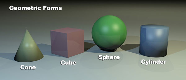
- GEOMETRIC FORMS
Geometric forms have specific names associated with them and are typically man-made.
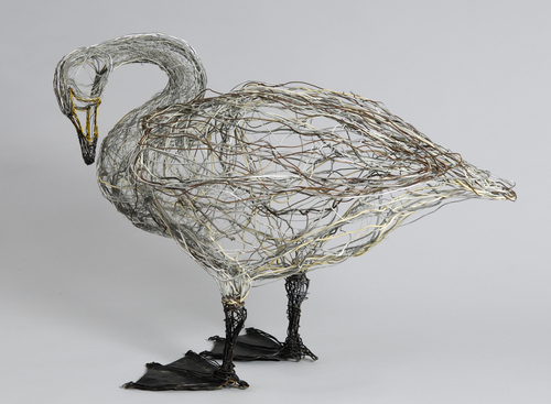
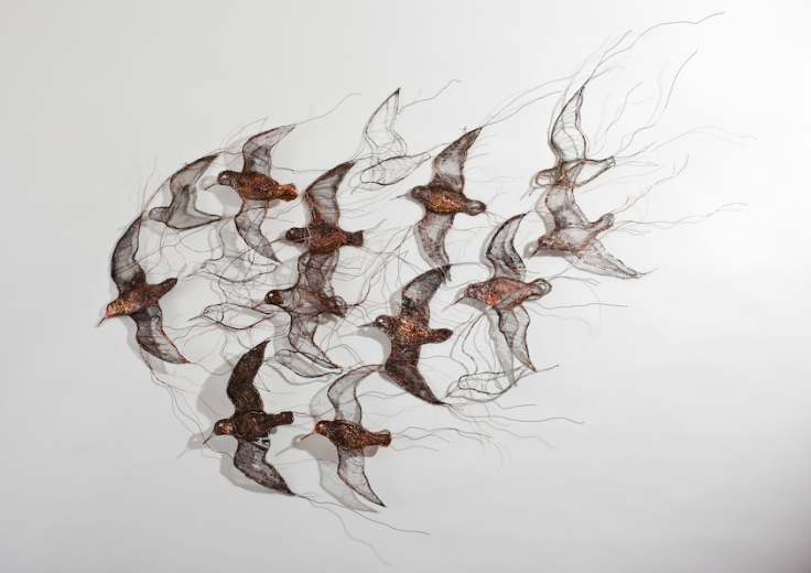
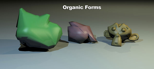
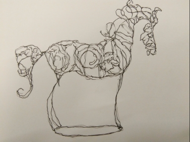
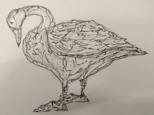
- ORGANIC FORM:
Organic forms do not have specific names associated with them and are often associated with naturally occurring forms.
The illusion of form by understanding how light reacts on the object:
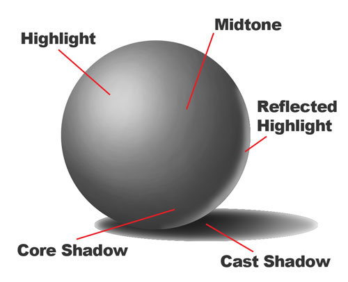
Light reacts on objects and is communicated to viewers through several factors. Adjusting these areas with values of the local color will result in the illusion of form in a drawing or painting.
- The highlight is the area where light is hitting the object directly.
- The midtone is the middle value of the local color of the object.
- The core shadow is the area(s) that is shaded on the object.
- The cast shadow is the area(s) that is shaded on surrounding objects and surfaces because of blocked light.
- The reflected highlight is the area on an object that is lighter because of reflected light off of surrounding objects.
2. What is SPACE?
The Element of Design Space refers to the area within, around, above or below an object or objects. It is important to creating and understanding both two dimensional or three dimensional works of art. With three dimensional art the space things occupy is real as is the space around object. In two dimensional art this is definitely not the case. Two dimensionall art exists on a flat surface, so if something looks three dimensional- it is an illusion! Even the most realistic paintings or photographs are illusions. Two dimensional artists use a number of “tricks” for creating the illusion of depth in their art.
Creating the Illusion of Space
- Size: larger objects appear closer, smaller further away
- Overlap : partially covering one shape (object with another makes the one in front appear closer.
- Placement: where a shape or object is in relationship to the horizon line creates depth. Things closer to the horizon line appear further away. Objects closer to the bottom or top of your paper (canvas, etc.) appear closer.
- Atmospheric perspective:objects as they recede into the distance begin to lose color brightness and detail.
- Shading: adding light and shadow to the surface of objects to mimic the way real objects would appear under the same lighting.
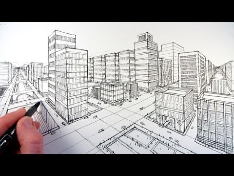
- Linear Perspective: This is a system of drawing developed during the Renaissance period of history (about 1400-1500). It use lines that converge on vanishing points to achieve a more realistic illusion of space. Linear perspective is described by the number of vanishing points used- one point, two point or three point. Type most often are used alone, but they may be combined in complex drawings or painitngs.
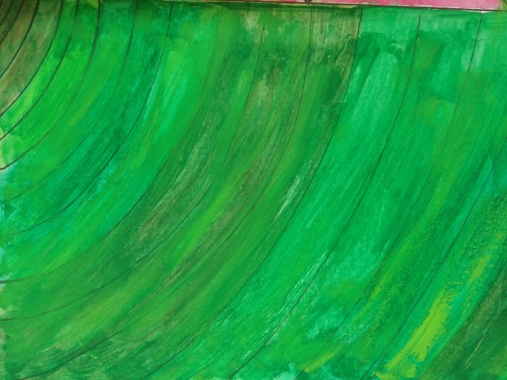
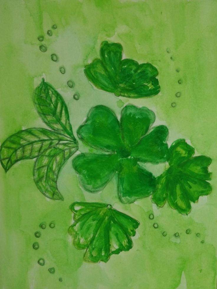
Examples of space:


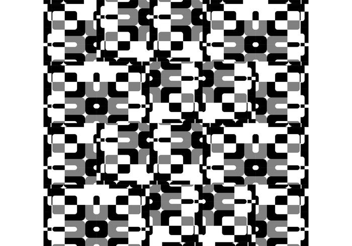
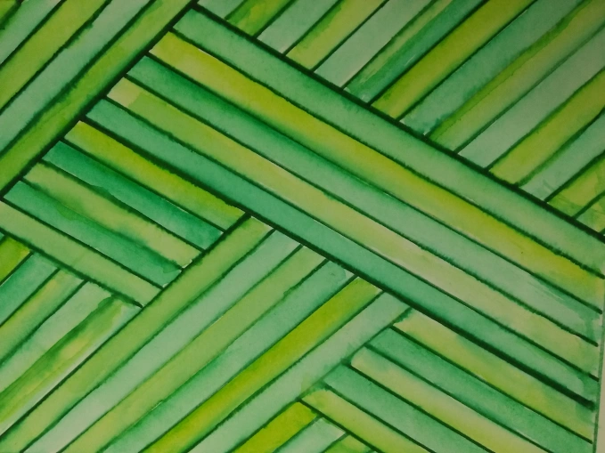
3.What is TEXTURE?
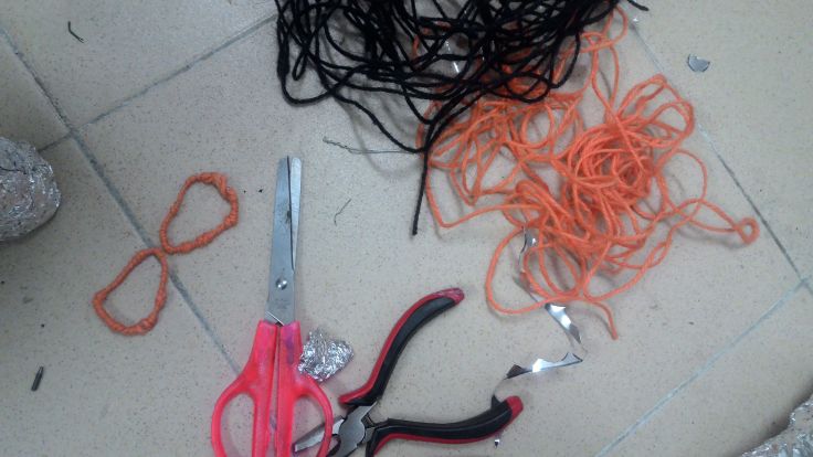
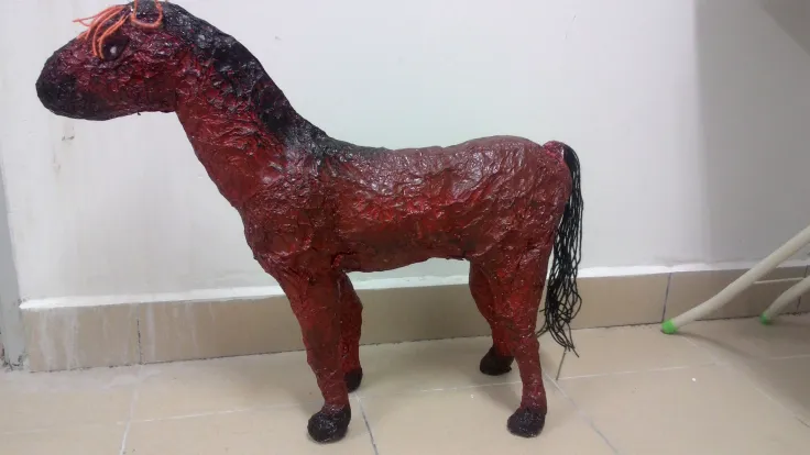
Texture refers to the surface quality in a work of art. We associate textures with the way that things look or feel. Everything has some type of texture. We describe things as being rough, smooth, silky, shiny, fuzzy and so on. Some things feel just as they appear; this is called real or actually texture. Some things look like they are rough but are actually smooth. Texture that is created to look like something it is not, is called visual or implied texture.
- Real Texture
Visual texture is the real thing. Real texture cannot be represented here because a computer screen, even with the highest quality photgraphs can only create simulate textures. However for the purpose of providing examples assume that these images are real. For examples:

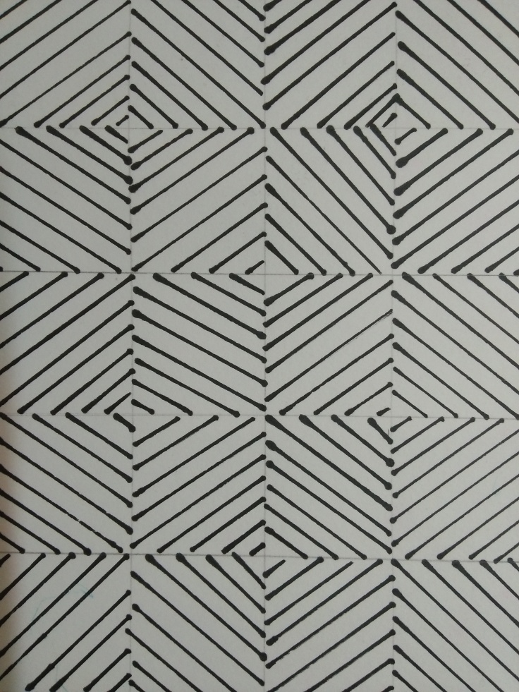
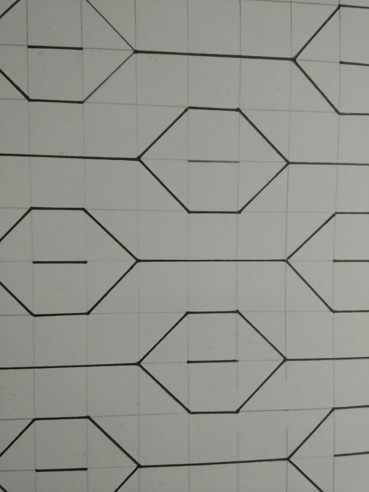
- Visual or Implied Texture
Visual or implied texture can be simulated or invented. Simulated texture is the type that is created to look like something it is not. For example, in drawing or painting of a cat where its fur is made to look like real fur. Invertn texture, on the other hand may look rough, smooth or any other feel but is purely made up by the artist. It does look like “real” texture. Examples:

4. Perspective drawing
Perspective Drawing is a technique used to represent three-dimensional images on a two-dimensional picture plane. In our series of lessons on perspective drawing we explain the various methods of constructing an image with perspective and show how these are used by artists and illustrators.
Perspective was developed in the 15th century by the architects, Leon Baptista Alberti (1404-72) and Filippo Brunelleschi (1377-1446). For 500 years, perspective drawing remained one of the basic principles of western art until it was challenged by the ideas of the cubist at the start of the 20th century.
Types of perspective:
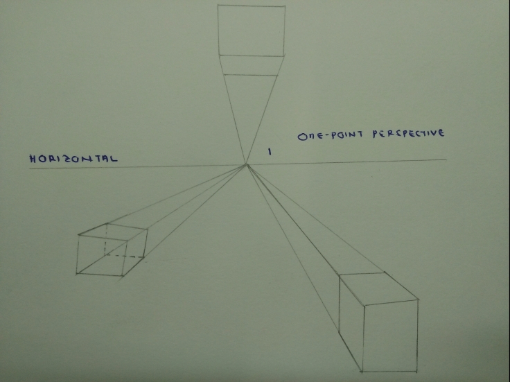
- One-point perspective
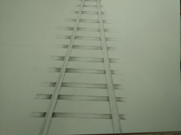
A drawing has one–point perspective when it contains only one vanishing point on the horizon line. This type of perspective is typically used for images of roads, railway tracks, hallways, or buildings viewed so that the front is directly facing the viewer.

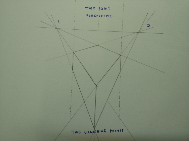
- Two-point perspective
Two point perspective drawing is a type of linear perspective. Linear perspective is a method using lines to create the illusion of space on a 2D surface. Two point perspective uses two points placed on the horizon line. Three point perspective uses three vanishing points.
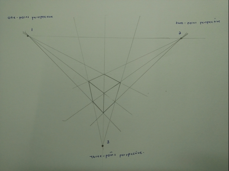
- Three-point perspective
Linear perspective in which parallel lines along the width of an object meet at two separate points on the horizon and vertical lines on the object meet at a point on the perpendicular bisector of the horizon line.

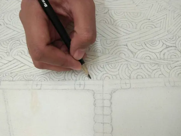
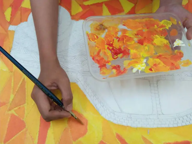
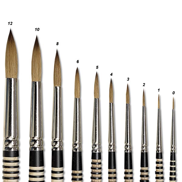
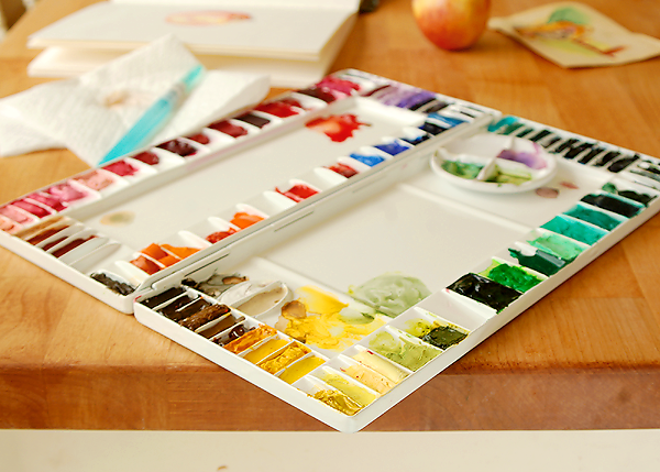
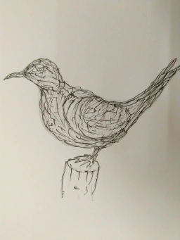
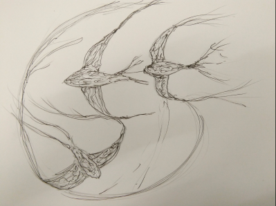
5. SKETCHES
- One-point Perspective
- Two-point perspective
- Three-point perspective
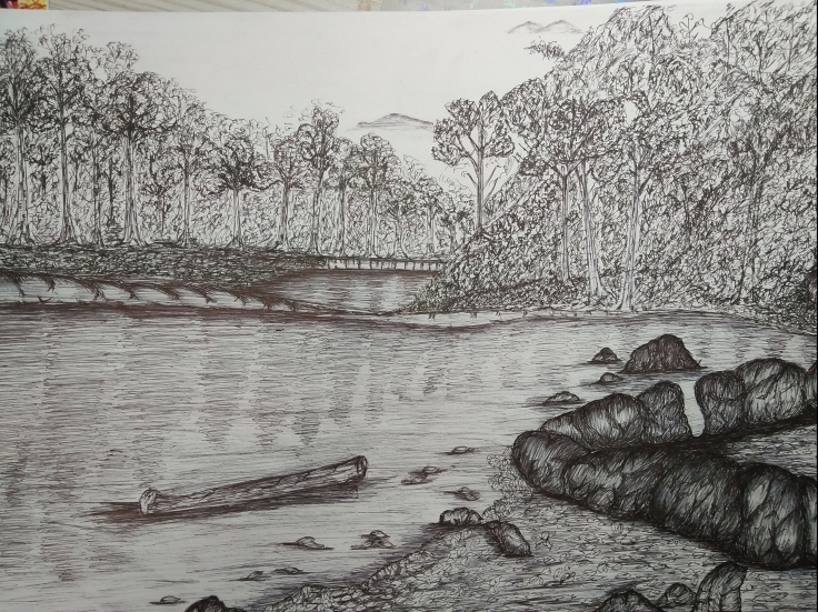
MY SKETCHES
")


 Sigmar Polke, Ohne Titel, 1981
 Bust Of A Woman With A Hat (1962)
")


")